project
案例分享
Client
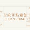
全統西點麵包|記憶中的美味,新時代的經典
Design Scope
品牌設計、品牌識別、品牌再造
ROJECT OVERVIEW
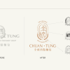
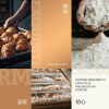
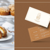
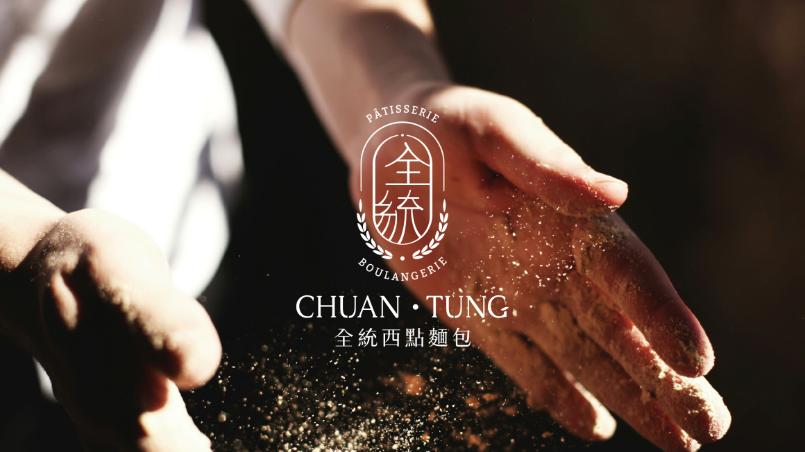
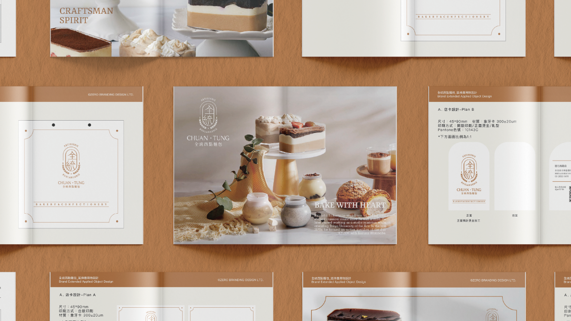
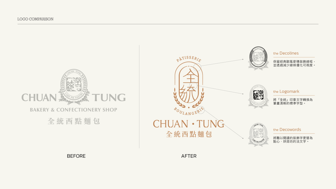
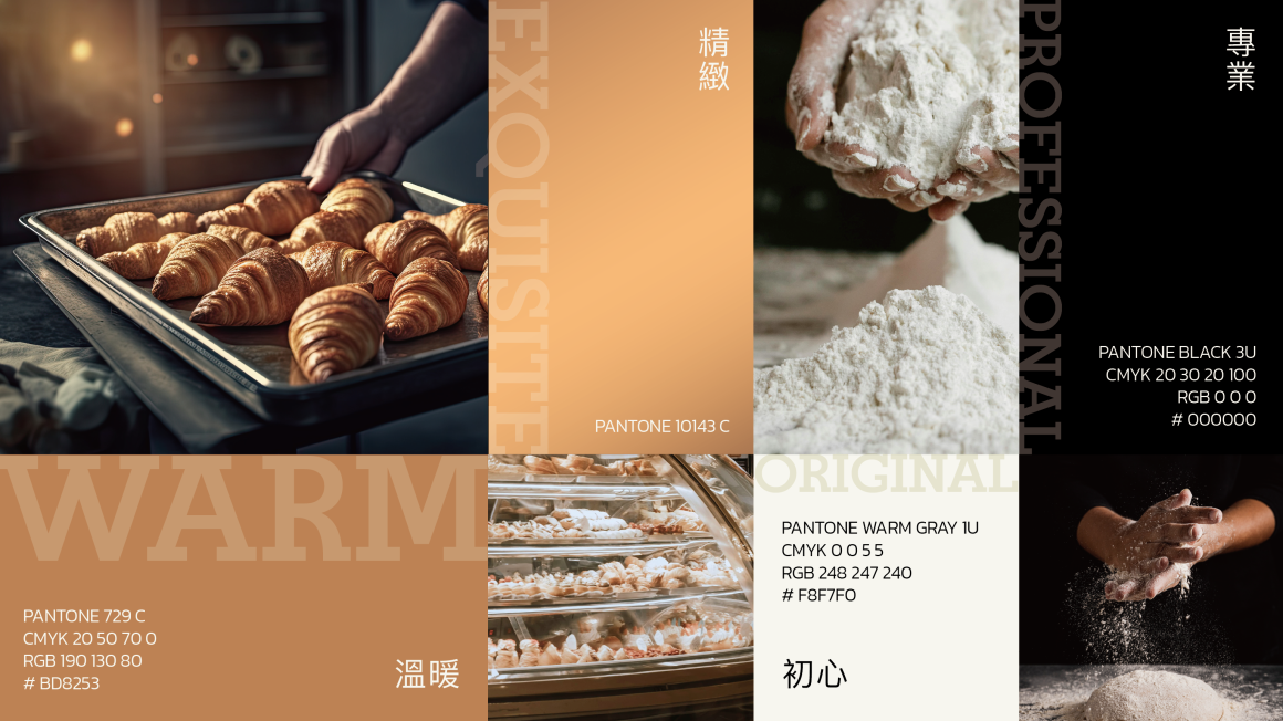
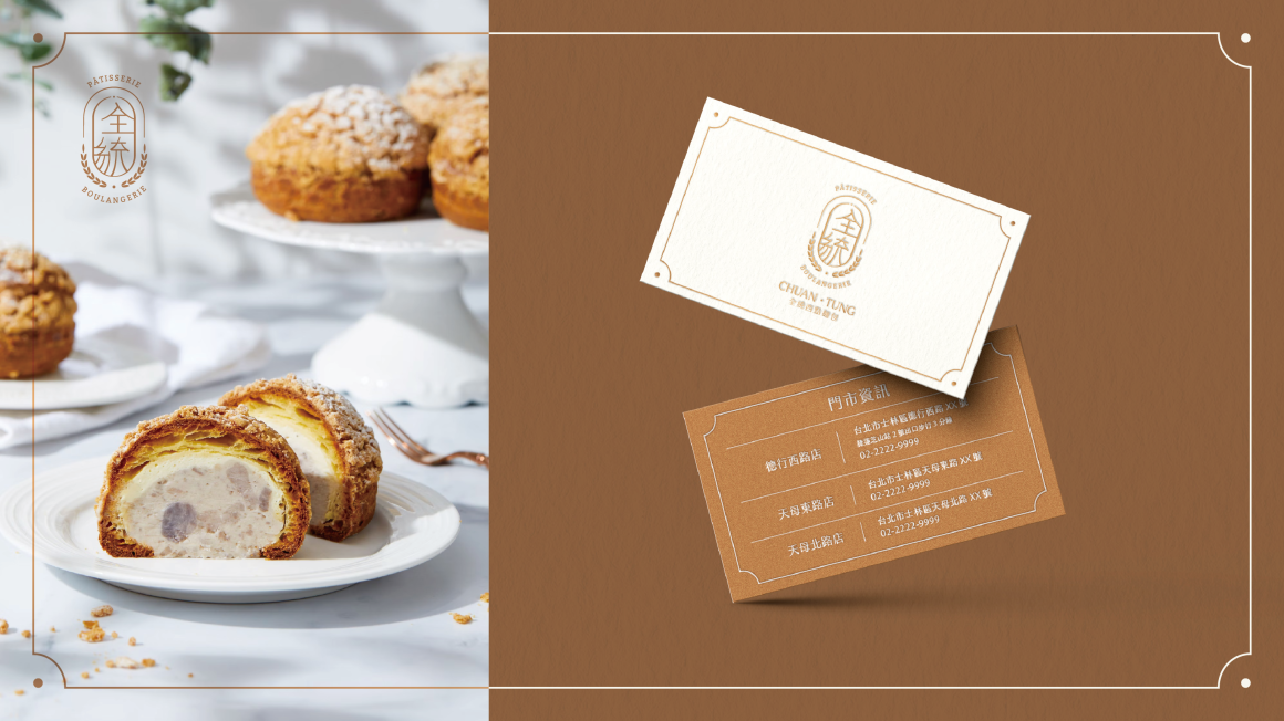
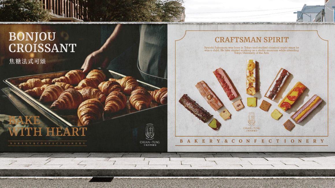
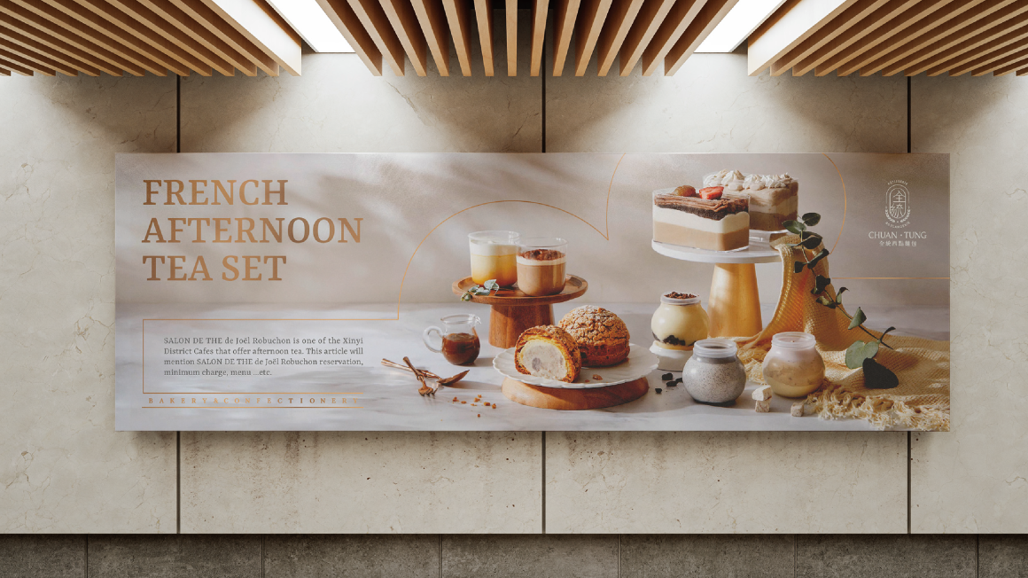
在烘焙坊林立的天母地區,全統擁有近四十年的經營基礎並在當地人心中留存著獨到美味的印記,因此有物在識別更新上保存舊有色系及大麥、草環等經典元素,針對難以規範、不夠清晰的「印鑑文字」和「草環裝飾」等元素進行視覺優化,幫助全統以經典不變的核心樣貌走向新時代。
DESIGN CONCEPT
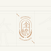
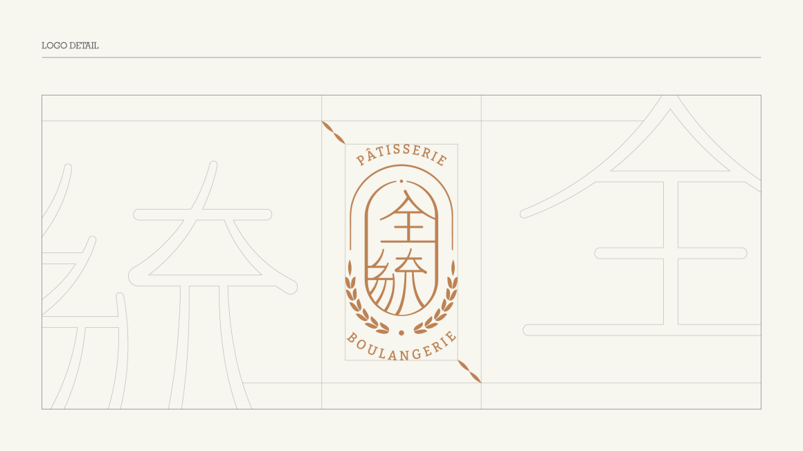
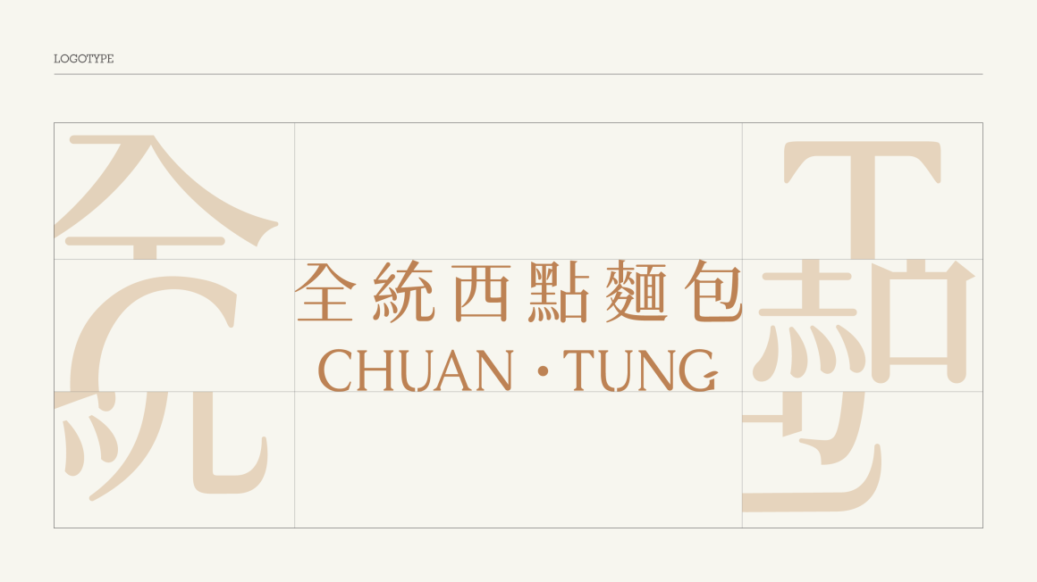
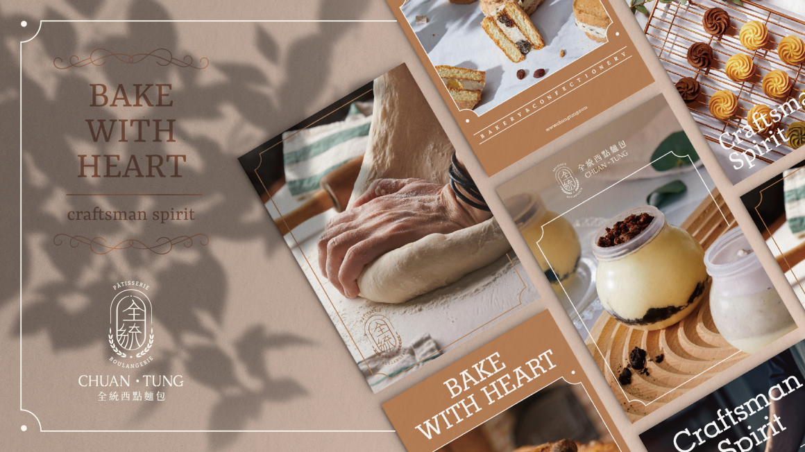
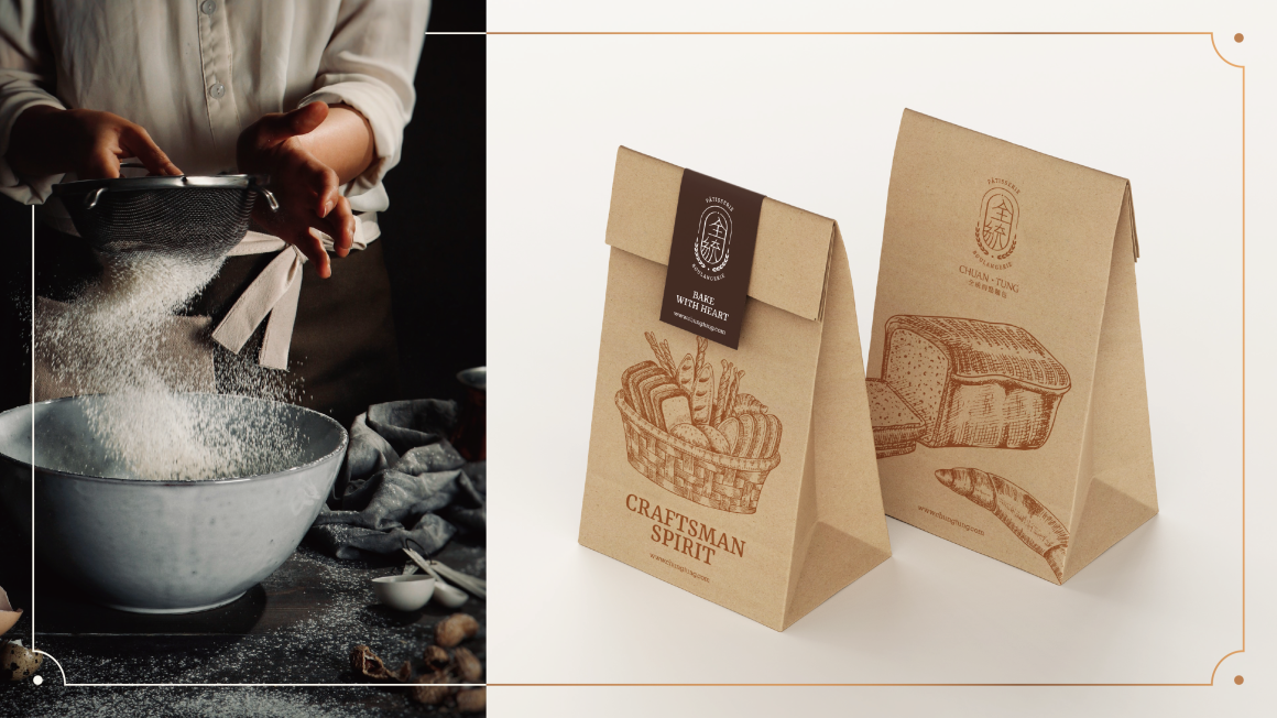
識別設計以「記憶中的美味,新時代的經典」為概念進行視覺優化,保留舊識別的「麥穗、線框、印章字」等經典元素,透過減法思維剔除過度複雜的線條與裝飾,讓品牌識別在新舊消費者心中留下更清晰的印象。
-
Project Overview
In the baking hub of Tianmu,CHUNG TUNG has been a staple for nearly 40 years, leaving a distinct mark of flavor in the hearts of locals. For this brand identity refresh, Yowu Design preserved the original color palette and iconic elements such as barley and the grass ring. The previously inconsistent and unclear “seal-style text” and “grass ring decoration” were visually optimized, helping CHUNG TUNG carry its classic essence into the modern era.
Design Concept
The identity design, centered around the concept of "The Taste of Memories, A New Age Classic," focused on visual optimization. Classic elements from the old identity, like the wheat stalks, frames, and seal-style text, were retained. Through a subtractive design approach, excessive lines and decorations were removed, ensuring the brand leaves a clearer impression in the minds of both new and loyal customers.


