


SCROLL


project
жЎҲдҫӢеҲҶдә«
Client
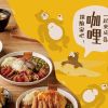
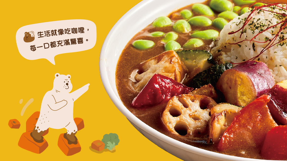
жғіжғіе’–е“© Enjoy CurryпҪңеӮійҒһжә«жҡ–иҰӘиҝ‘жғ…ж„ҹпјҢеңЁж»ҝвҫңдёӯдә«еҸ—
Design Scope
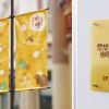
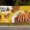
е“ҒзүҢиӯҳеҲҘзі»зөұиЁӯиЁҲгҖҒе“ҒзүҢиӯҳеҲҘжҮүз”ЁиЁӯиЁҲгҖҒй–ҖеёӮеҪўиұЎиЁӯиЁҲ
Project Overview
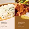
еӮійҒһжә«жҡ–иҰӘиҝ‘жғ…ж„ҹпјҢеңЁж»ҝвҫңдёӯдә«еҸ—гҖӮ
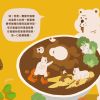
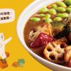
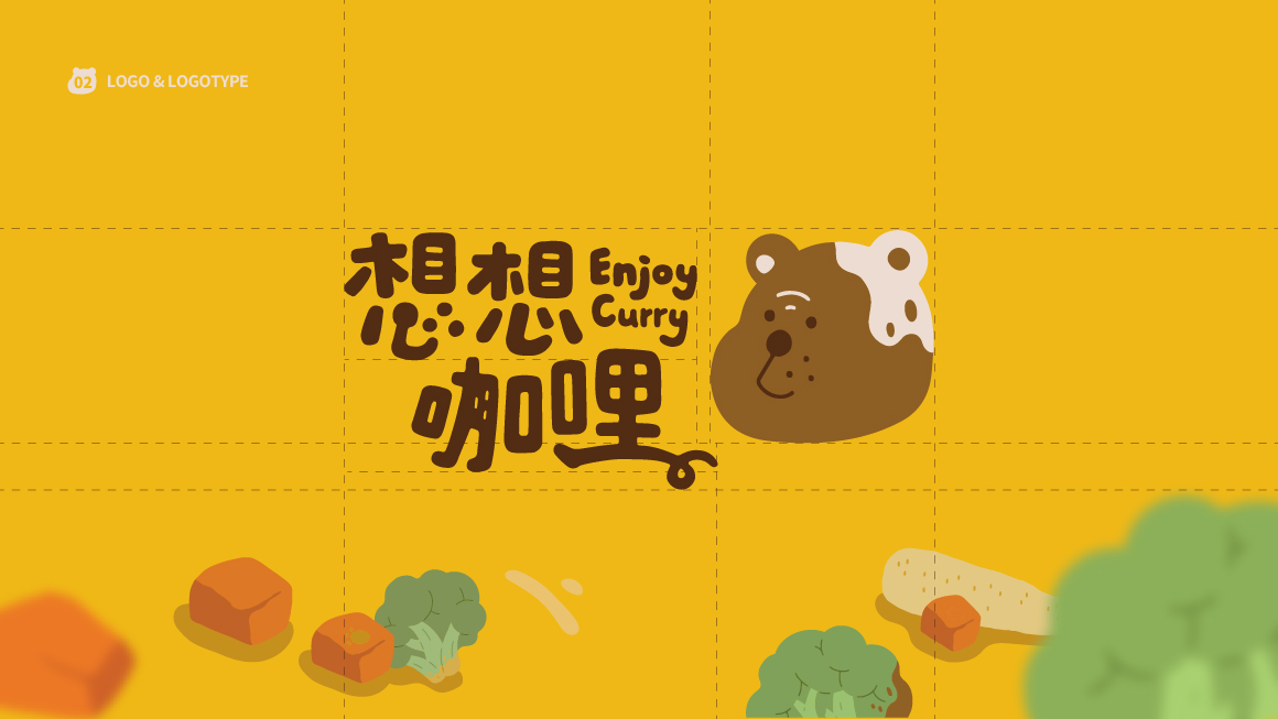
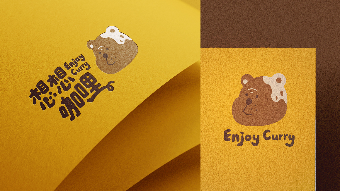
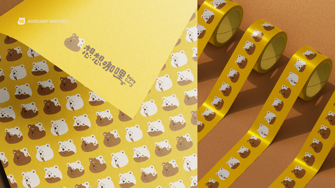
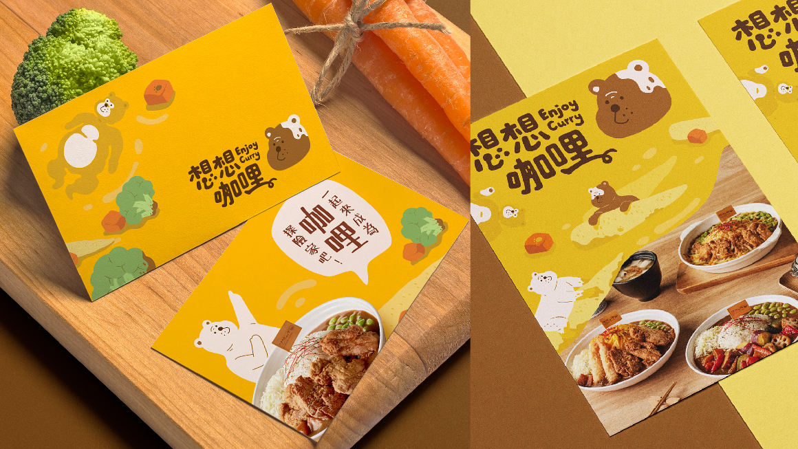
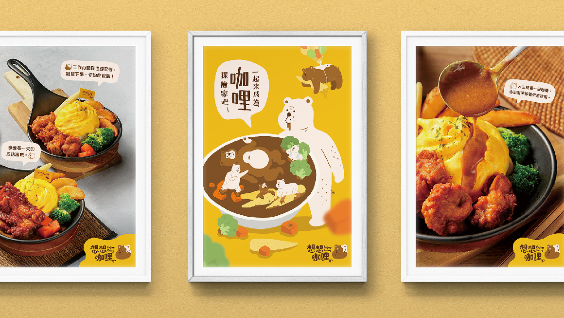
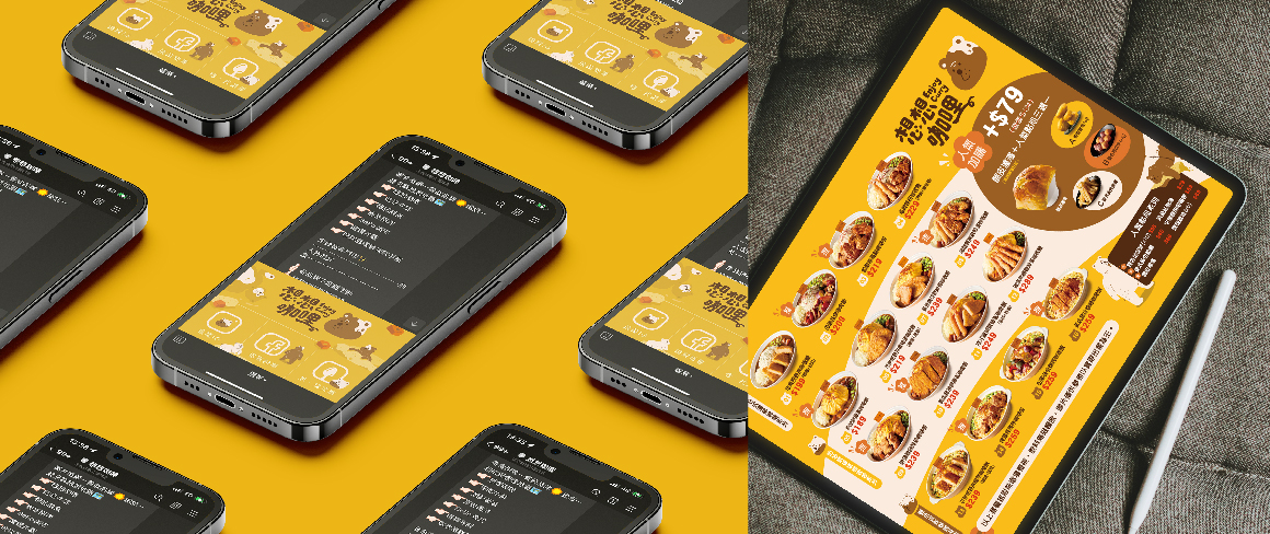
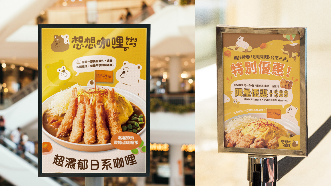
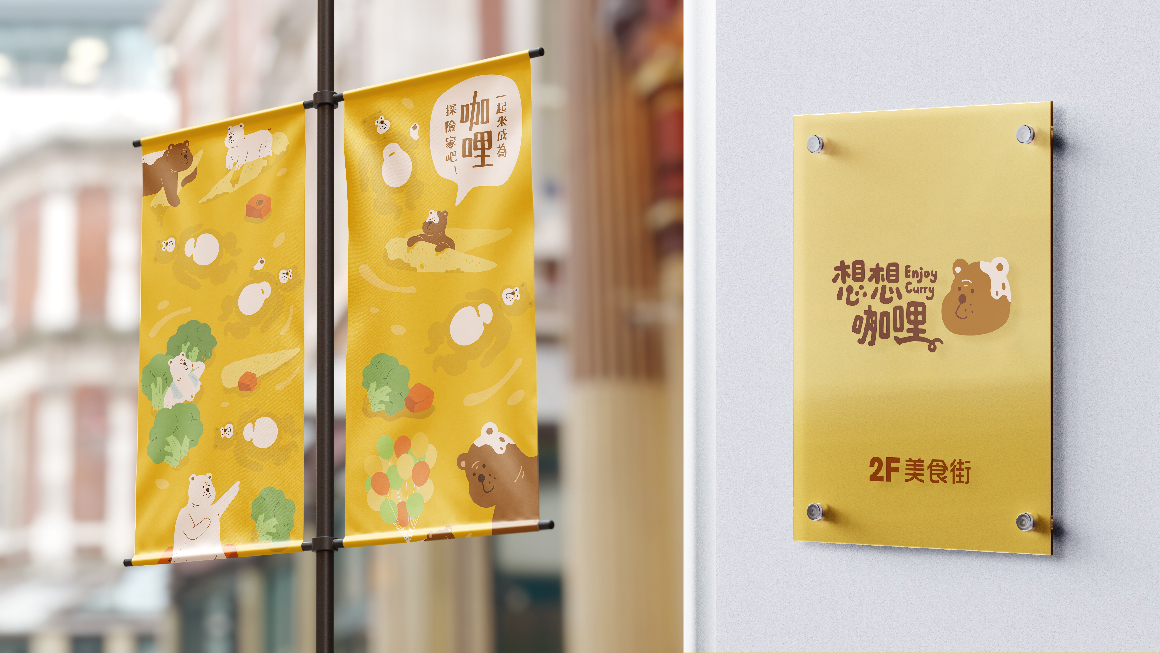
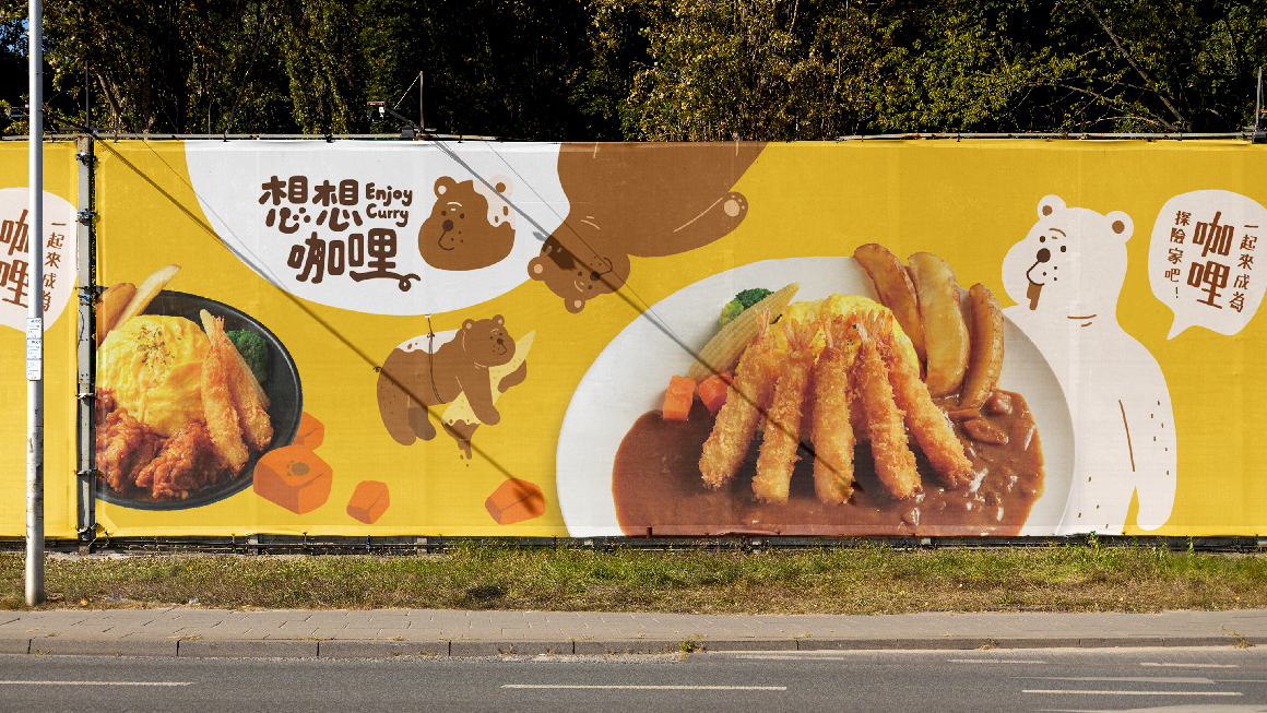
жғіжғіе’–е“©и—үз”ұеӯ©з«ҘйҒӢвҪӨеЎ—йҙүдҫҶеүөйҖ вҪЈжҙ»дёӯзҡ„жЁӮи¶ЈпјҢйҖҸйҒҺжІ’жңүжЎҶжһ¶гҖҒеӯ©з«ҘеЎ—йҙүж„ҹзҡ„жЁҷжә–еӯ—иЁӯиЁҲдҫҶеүөйҖ е“ҒзүҢзҡ„иҰӘеҲҮгҖҒжІ’жңүи·қйӣўж„ҹпјҢдёҰиһҚеҗҲIPвҫ“вҫҠзҶҠж„ӣе“©зҡ„зү№еҫөпјҢи®“ж•ҙй«”жЁҷиӘҢиҲҮж«ғдҪҚиҰ–иҰәжңүеҫҲеҘҪзҡ„е‘јжҮүгҖӮ
Design Concept
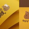
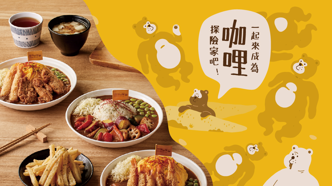
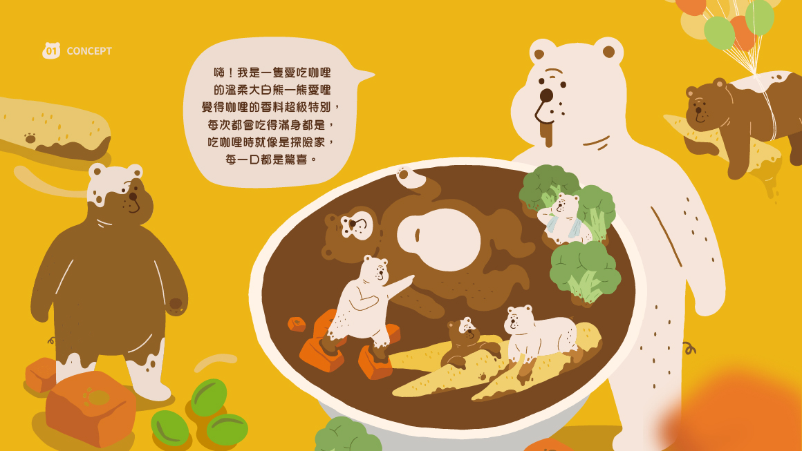
жЁҷиӘҢиЁӯиЁҲдёҠд»ҘIPвҫ“вҫҠзҶҠж„ӣе“©еҗғеҫ—ж»ҝ иҮүйғҪжҳҜе’–е“©зҡ„зӢҖж…ӢдёӢе‘ҲзҸҫпјҢйҖҸйҒҺд№ҫж·Ёзҡ„вҪ©вҫҠиҖіжңөдҫҶиұЎеҫөе’–е“©иҲҮйЈҜд№Ӣй–“зҡ„иҰ–иҰәж„ҸиұЎгҖӮ
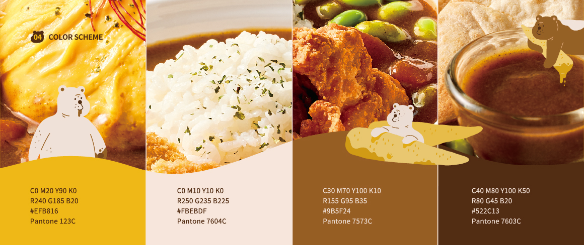
е“ҒзүҢвҫҠеҪ©йҒёвҪӨжҙ»жҪ‘йҷҪе…үзҡ„й»ғвҫҠеҸҠе’–е“©вҫҠдҫҶе‘ҲзҸҫе’–е“©зҡ„жә«е’ҢеҸҠжә«жҡ–пјҢд№ҹиұЎеҫөеӯ©з«ҘеңЁеүөдҪңзҡ„йҒҺзЁӢдёӯзҡ„жҙ»вј’еҸҠиұҗеҜҢеүөйҖ гҖӮ
-
Project Overview
Convey warmth and a sense of closeness, enjoying satisfaction in the process.
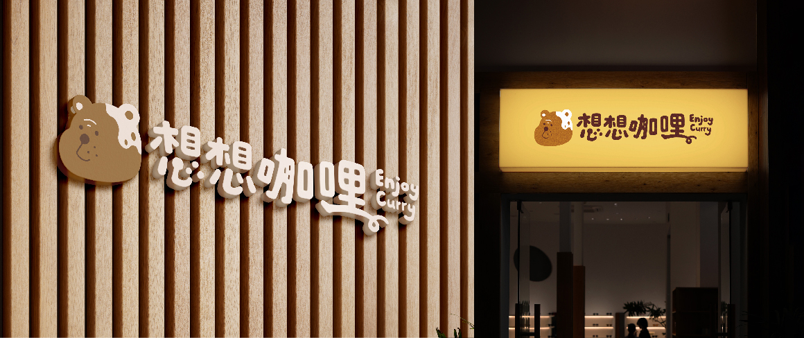
Imagine curry bringing joy to life through children’s doodles, creating a playful and unrestricted vibe. The brand’s logotype design adopts a childlike, free-spirited doodle style to establish an approachable and relatable identity. Incorporating the characteristics of the IP character, "Bear Ellie," the overall logo harmoniously aligns with the visual identity of the storefront and displays.
Design Concept
The logo design features the IP character "Bear Ellie" enjoying curry, with its face covered in curry to convey the playful moment.
Clean white ears are used to symbolize the visual connection between curry and rice. The brand's color palette adopts vibrant and sunny yellow along with curry tones to represent the warmth and gentleness of curry, while also symbolizing the energy and creativity of children during the process of creation.
еӮійҒһжә«жҡ–иҰӘиҝ‘жғ…ж„ҹпјҢеңЁж»ҝвҫңдёӯдә«еҸ—гҖӮ
жғіжғіе’–е“©и—үз”ұеӯ©з«ҘйҒӢвҪӨеЎ—йҙүдҫҶеүөйҖ вҪЈжҙ»дёӯзҡ„жЁӮи¶ЈпјҢйҖҸйҒҺжІ’жңүжЎҶжһ¶гҖҒеӯ©з«ҘеЎ—йҙүж„ҹзҡ„жЁҷжә–еӯ—иЁӯиЁҲдҫҶеүөйҖ е“ҒзүҢзҡ„иҰӘеҲҮгҖҒжІ’жңүи·қйӣўж„ҹпјҢдёҰиһҚеҗҲIPвҫ“вҫҠзҶҠж„ӣе“©зҡ„зү№еҫөпјҢи®“ж•ҙй«”жЁҷиӘҢиҲҮж«ғдҪҚиҰ–иҰәжңүеҫҲеҘҪзҡ„е‘јжҮүгҖӮ
Design Concept
жЁҷиӘҢиЁӯиЁҲдёҠд»ҘIPвҫ“вҫҠзҶҠж„ӣе“©еҗғеҫ—ж»ҝ иҮүйғҪжҳҜе’–е“©зҡ„зӢҖж…ӢдёӢе‘ҲзҸҫпјҢйҖҸйҒҺд№ҫж·Ёзҡ„вҪ©вҫҠиҖіжңөдҫҶиұЎеҫөе’–е“©иҲҮйЈҜд№Ӣй–“зҡ„иҰ–иҰәж„ҸиұЎгҖӮ
е“ҒзүҢвҫҠеҪ©йҒёвҪӨжҙ»жҪ‘йҷҪе…үзҡ„й»ғвҫҠеҸҠе’–е“©вҫҠдҫҶе‘ҲзҸҫе’–е“©зҡ„жә«е’ҢеҸҠжә«жҡ–пјҢд№ҹиұЎеҫөеӯ©з«ҘеңЁеүөдҪңзҡ„йҒҺзЁӢдёӯзҡ„жҙ»вј’еҸҠиұҗеҜҢеүөйҖ гҖӮ
-
Project Overview
Convey warmth and a sense of closeness, enjoying satisfaction in the process.
Imagine curry bringing joy to life through children’s doodles, creating a playful and unrestricted vibe. The brand’s logotype design adopts a childlike, free-spirited doodle style to establish an approachable and relatable identity. Incorporating the characteristics of the IP character, "Bear Ellie," the overall logo harmoniously aligns with the visual identity of the storefront and displays.
Design Concept
The logo design features the IP character "Bear Ellie" enjoying curry, with its face covered in curry to convey the playful moment.
Clean white ears are used to symbolize the visual connection between curry and rice. The brand's color palette adopts vibrant and sunny yellow along with curry tones to represent the warmth and gentleness of curry, while also symbolizing the energy and creativity of children during the process of creation.