project
案例分享
Client
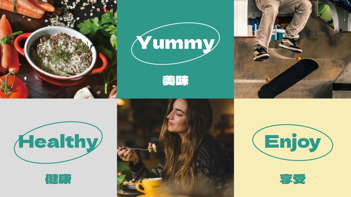
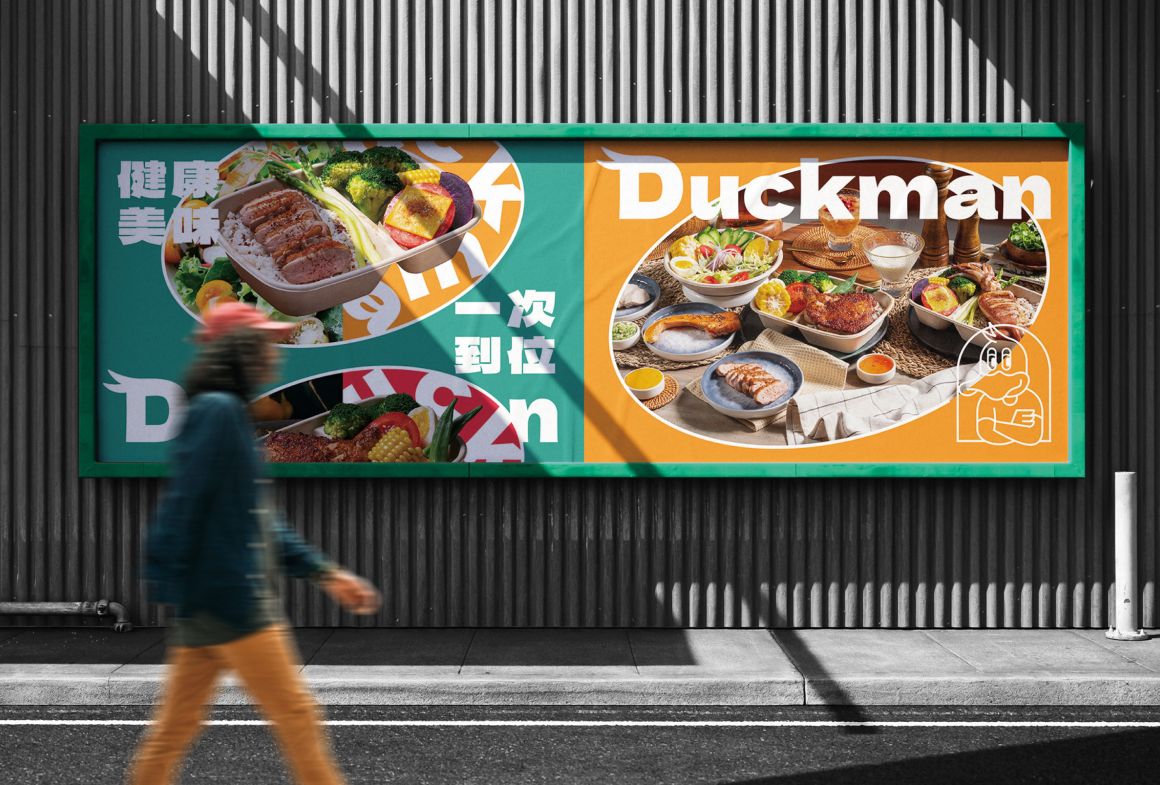
鴨男舒肥輕食餐盒 DUCKMAN|健康美味一次到位
Design Scope
品牌建構、品牌定位、品牌設計、門市形象設計
PROJECT OVERVIEW
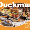
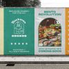
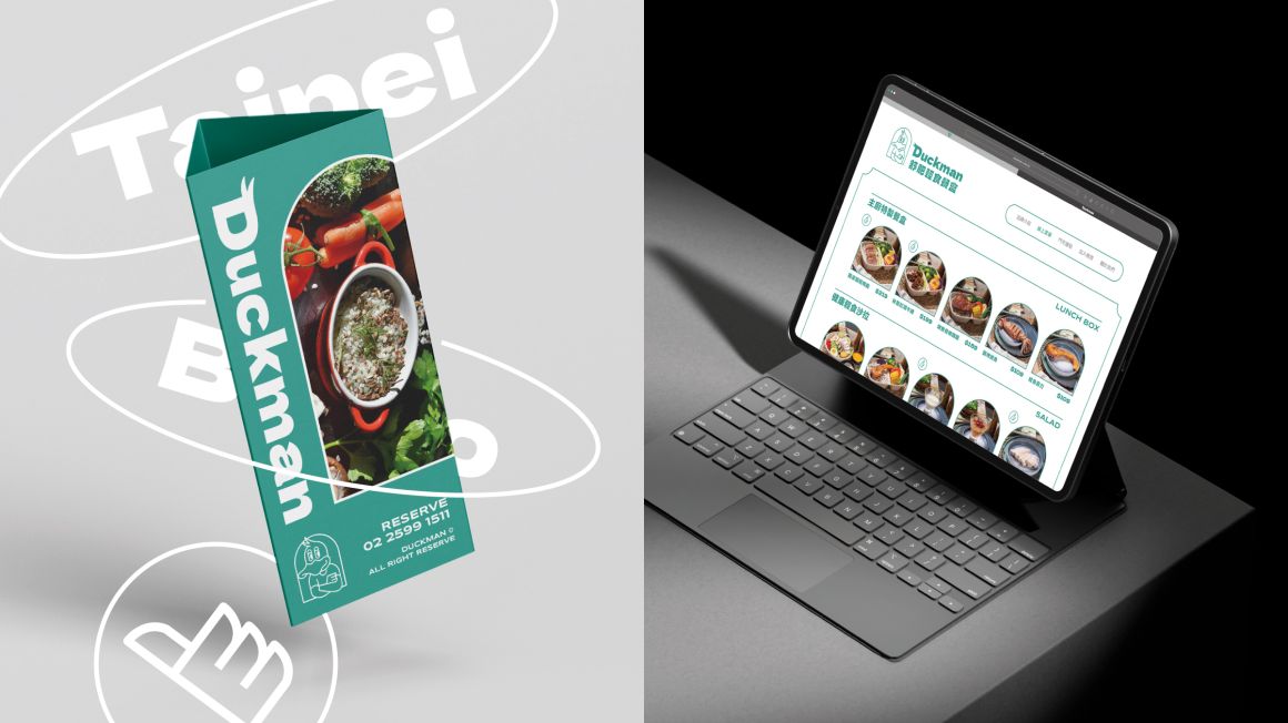
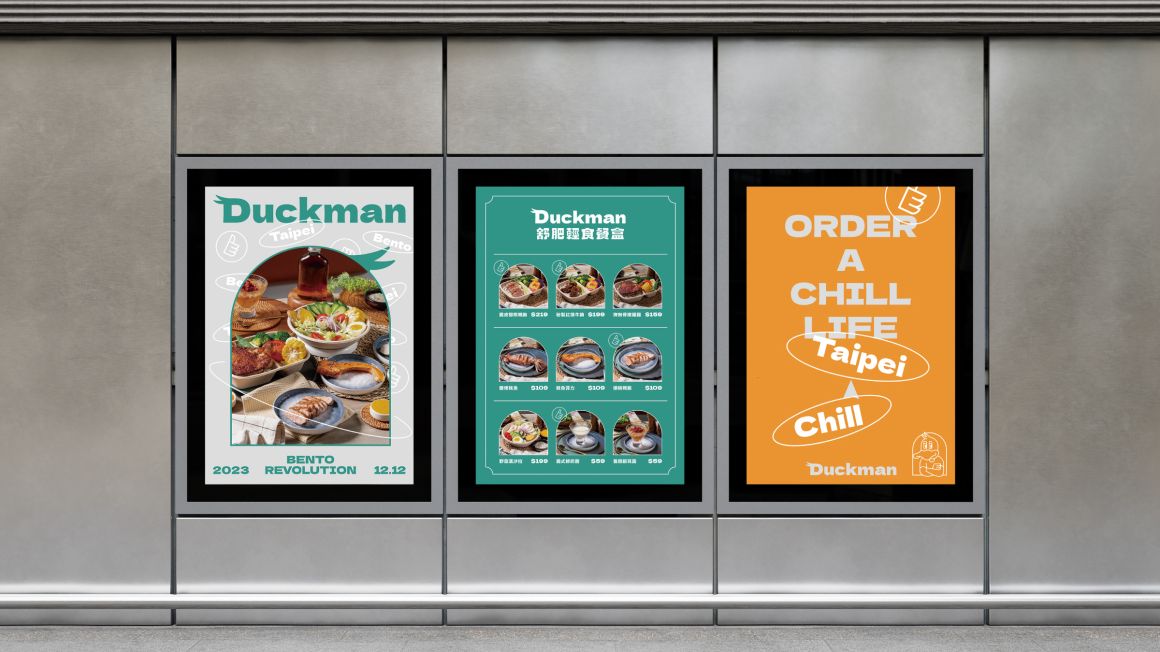
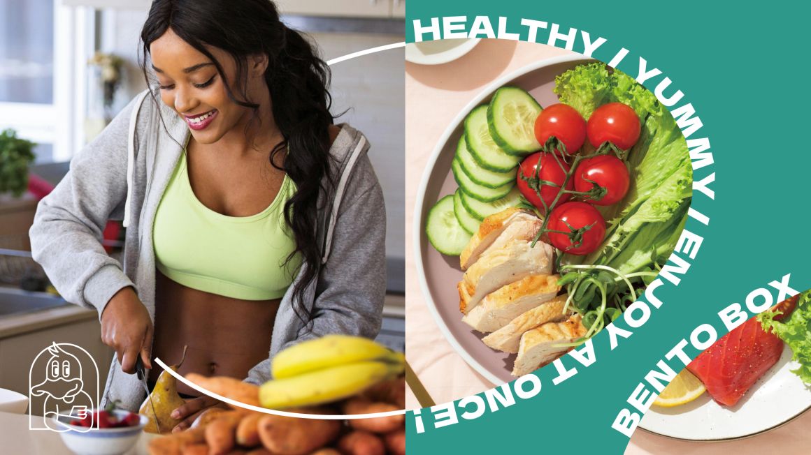
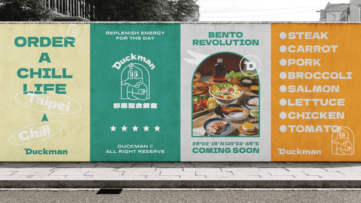
Duckman是一間位於台北市的輕食餐盒店,主打以舒肥烹調的方式,讓餐點吃得更清爽也更營養;醬料經由主廚顧問研發,提供不同於一般水煮餐盒的精緻美味,讓忙碌的上班族能以輕鬆、沒有壓力的方式享用健康又美味的餐點。
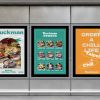
在一眾以食物為視覺重點的競爭市場中,有物以擬人化的手法打造品牌識別角色,讓Duckman在琳琅滿目的輕食餐盒中,樹立清新獨特的品牌形象。
DESIGN CONCEPT
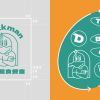
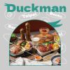
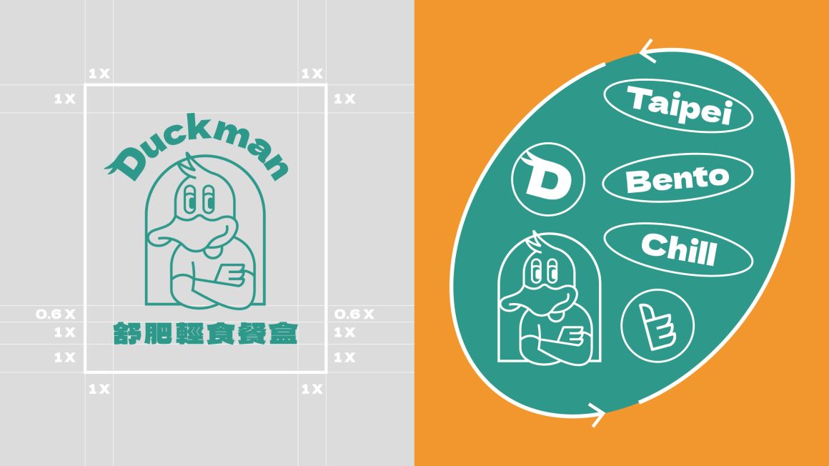
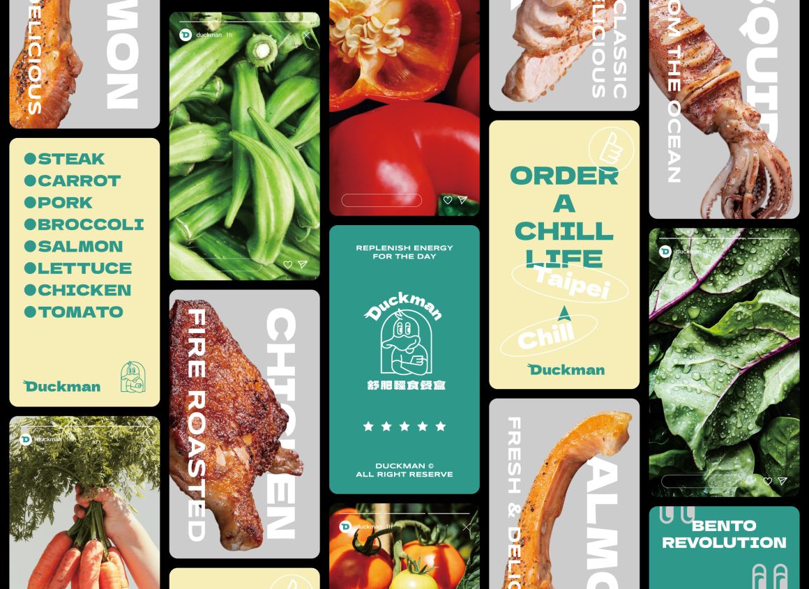
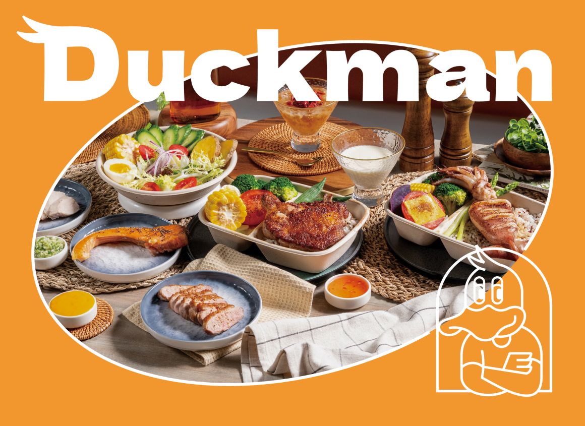
在品牌設計方向上,有物以“Chill 鴨男”的形象進行規劃,角色愜意的神情與放鬆的姿勢,表現輕鬆幽默的品牌個性,如同品牌以親切的方式傳遞健康美味的舒肥料理。
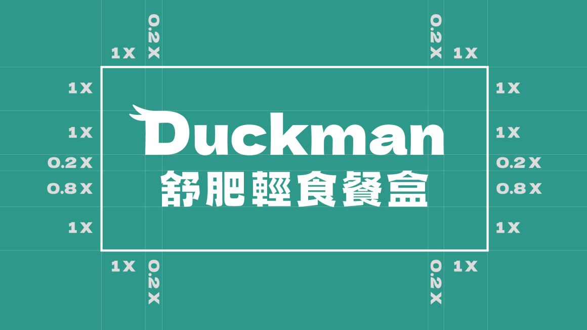
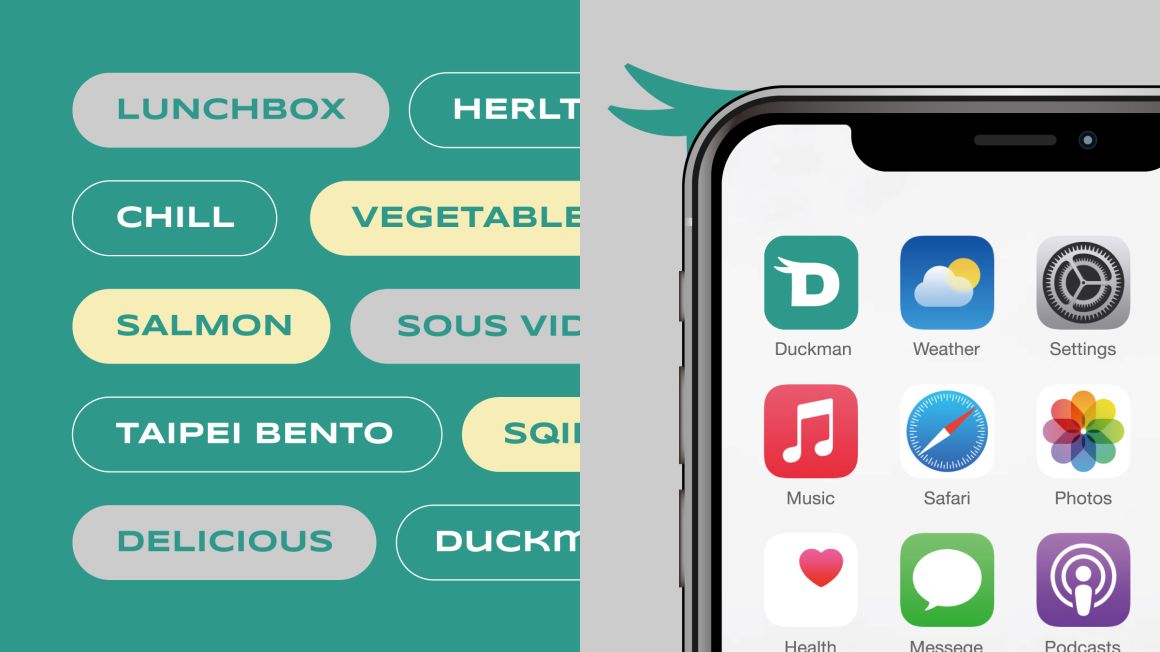
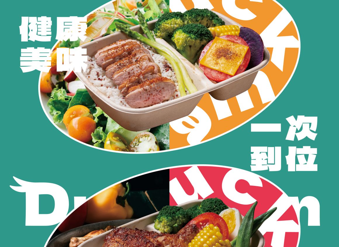
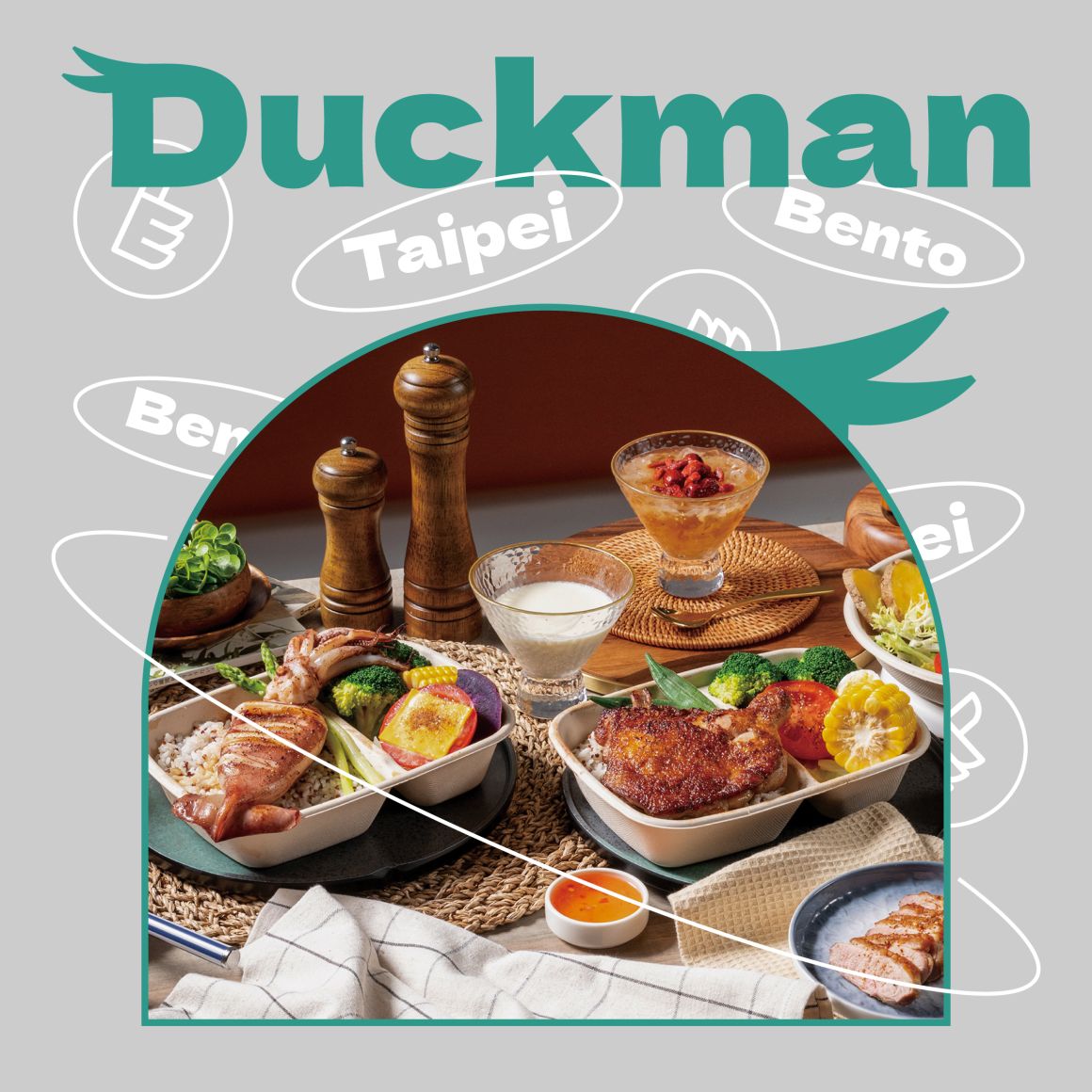
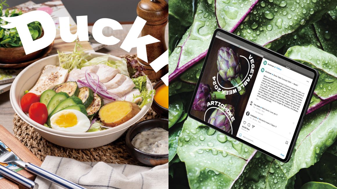
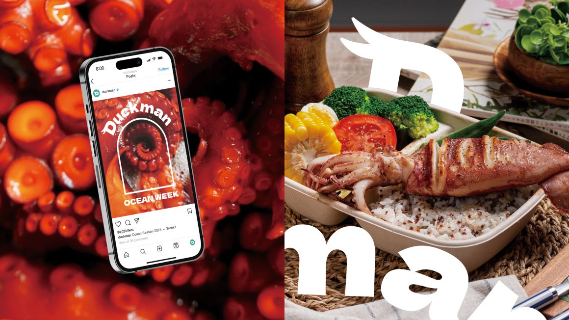
英文標準字選用粗壯厚實的無襯線字型,傳遞品牌「健康美味一次到位」的滿足感,“D“字上方加上鴨男插畫的兩根瀏海增加趣味性,中文標準字則使用較為活潑的字型,讓整體標誌給人活力十足的印象,在多媒體運用中也更為豐富多變。
-
PROJECT OVERVIEW
Duckman is a light meal bento store located in Taipei, specializing in sous-vide cooking to offer meals that are both lighter and more nutritious. The sauces, developed by a consulting chef, provide a refined and flavorful alternative to typical boiled bento boxes, allowing busy office workers to enjoy healthy, delicious meals in a relaxed and stress-free way.
In a competitive market where food-centric visuals dominate, Duckman’s brand identity stands out through a personified character design, created by Have Creative, which establishes a fresh and unique brand image among the array of light meal options.
DESIGN CONCEPT
For the brand design direction, Have Creative developed the character of "Chill Duckman." His relaxed expression and laid-back posture reflect the easygoing, humorous personality of the brand, which delivers healthy and flavorful sous-vide dishes in a friendly manner.
The English logotype uses a bold, solid sans-serif font to convey the sense of satisfaction from "healthy and delicious all in one." The playful touch of two strands of Duckman’s hair atop the "D" adds charm, while the Chinese logotype features a more lively font, giving the overall logo a vibrant and energetic impression. This dynamic branding is designed to be versatile across multimedia applications.
