project
案例分享
Client
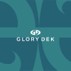
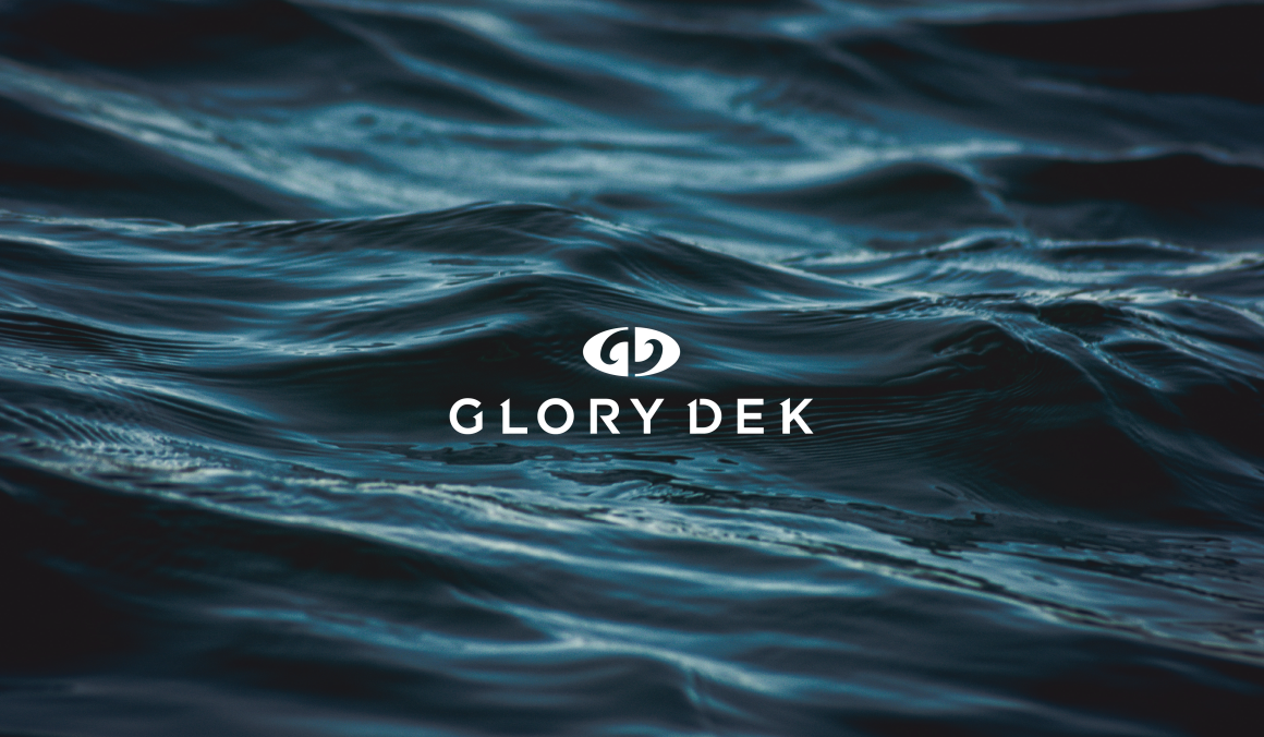
鎔利興業 GLORY DEK|與海洋共存共榮
Design Scope
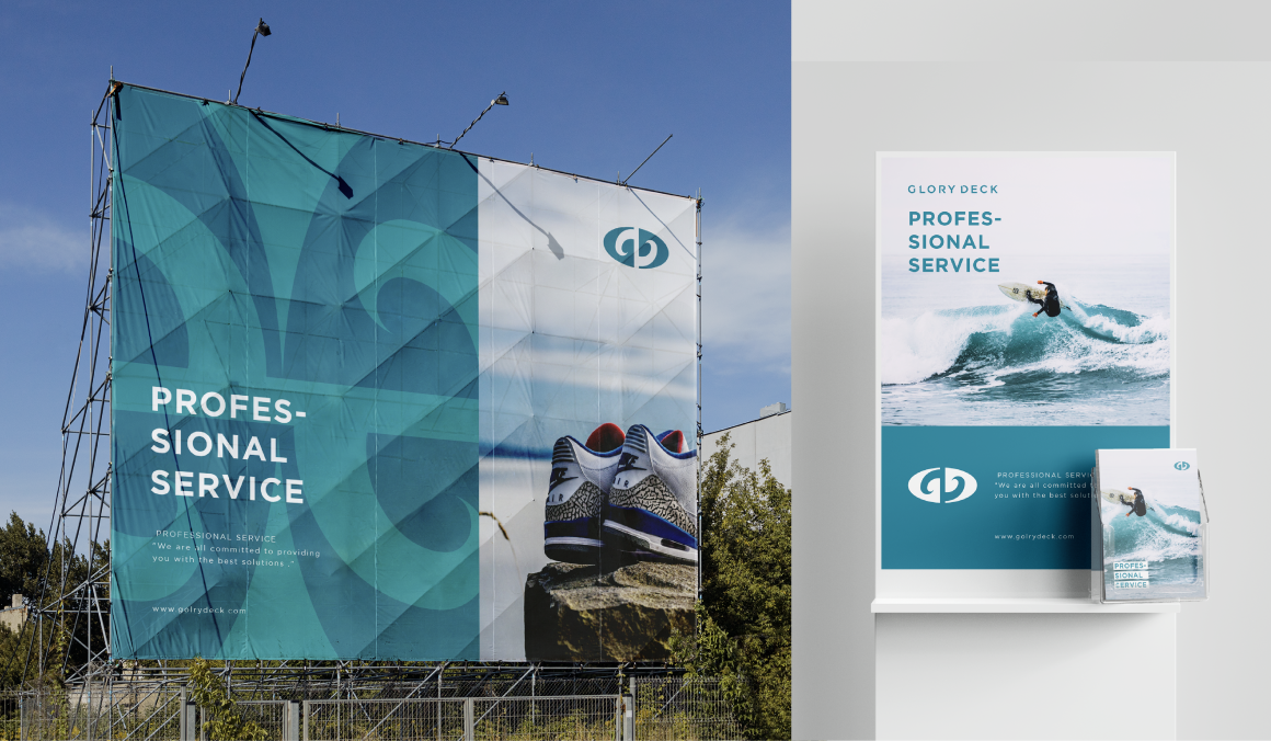
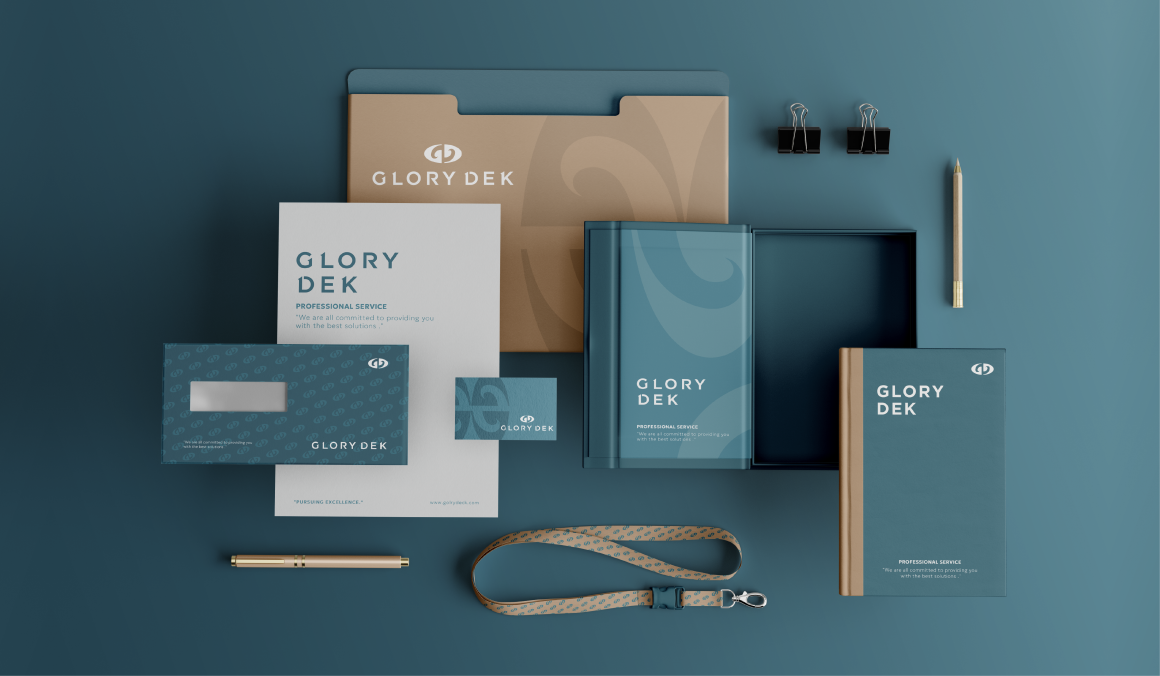
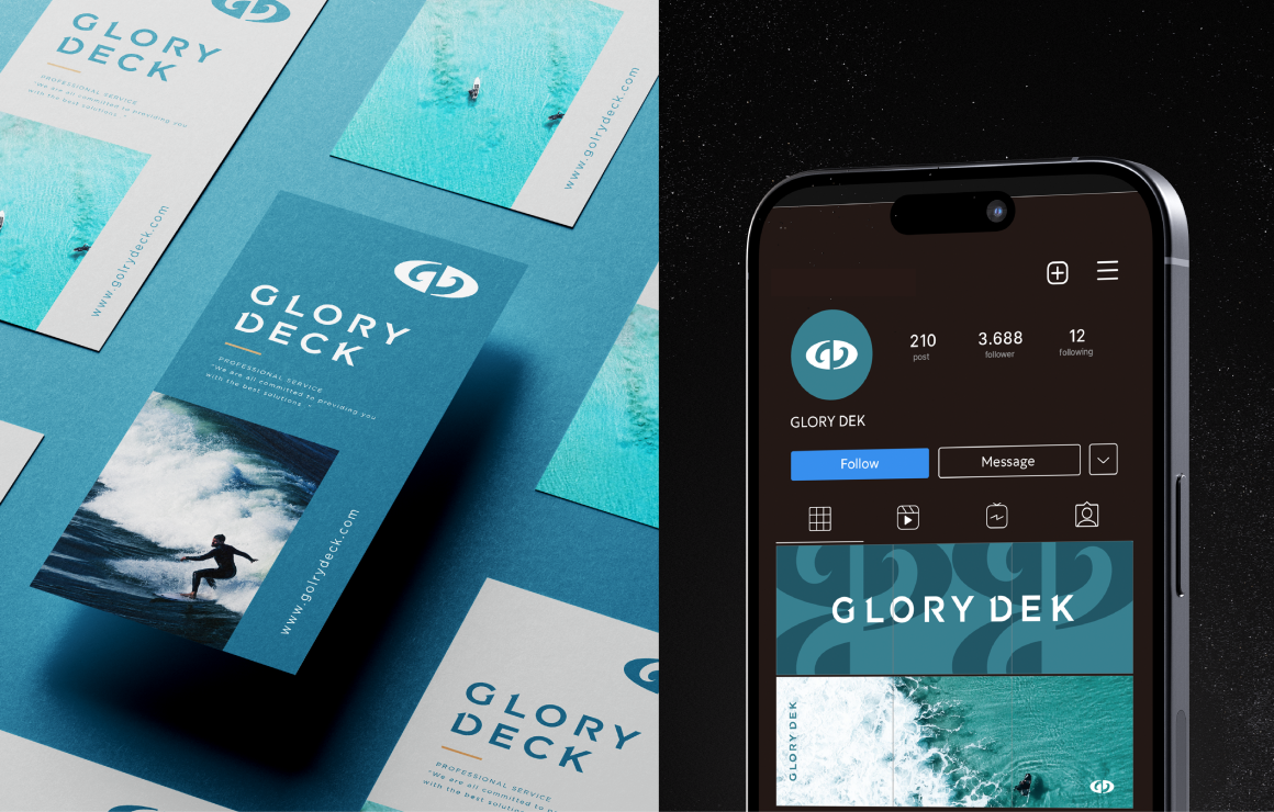
企業識別、CIS設計、品牌識別、CIS設計、品牌應用物設計
Project Overview
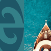
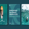
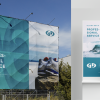
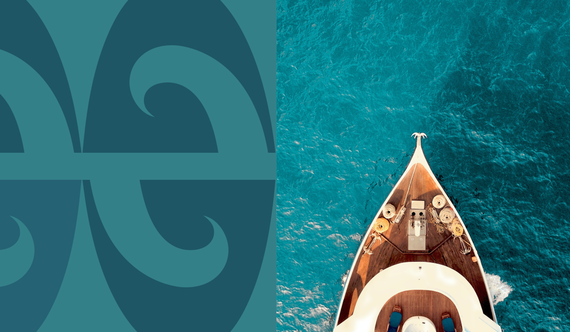
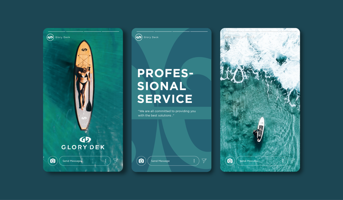
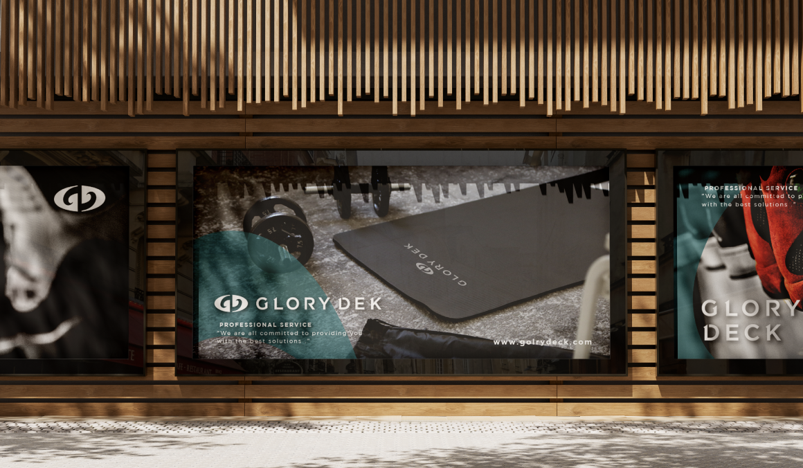
與海洋共存共榮做為出發點,品牌結合『海洋』的波浪意象,展現自體淬鍊、逆流無畏的精神。透過品牌的建立,傳達Glory Dek在研發、技術與服務的專業形象,傳遞品牌完善產業經營的動態交互關係,並藉由產品近距離接觸大自然原始樣貌,打造泡棉市場指標品牌。
Design Concept
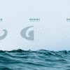
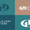
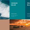
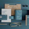
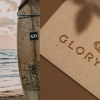
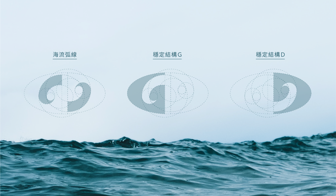
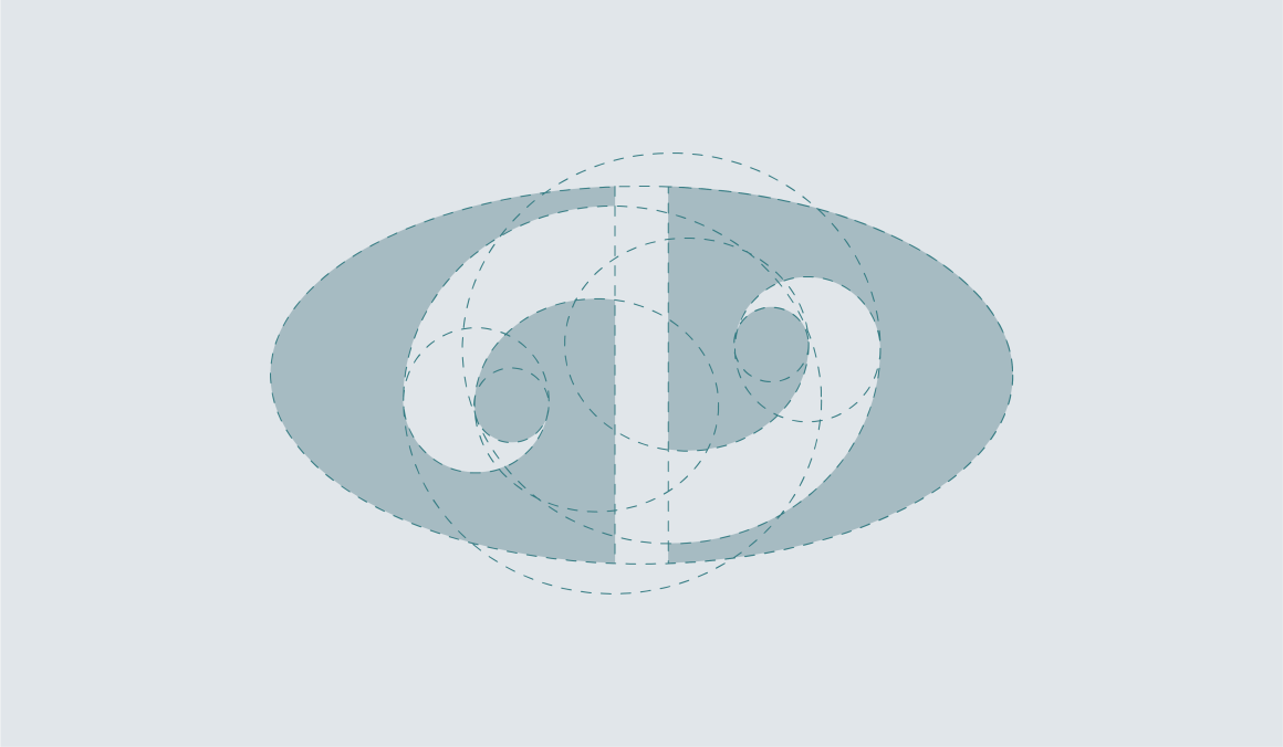
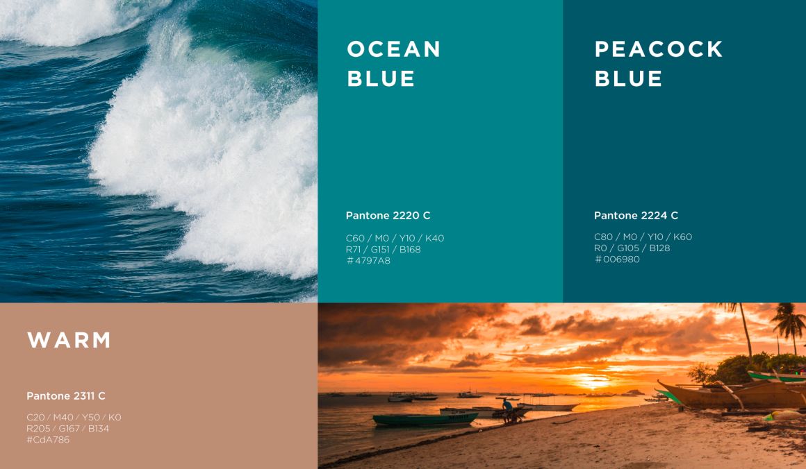
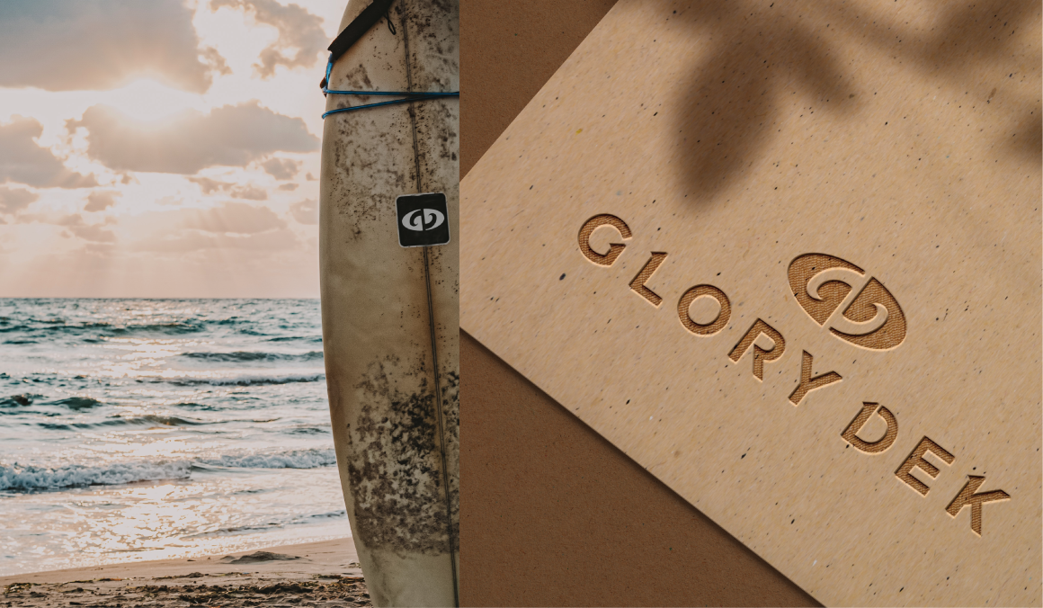
以厚實的色塊為視覺基底,呈現穩重、踏實的品牌形象,結合品牌字首『G』、『D』的造型,並在負空間中融入海浪的意象,顛倒手法的設計保留多重想像空間,象徵渴望求新、追求卓越的核心理念。
-
Project Overview
Starting with the principle of coexisting and thriving with the ocean, the brand incorporates the imagery of ocean waves to represent self-refinement and fearless resilience against the current. Through the establishment of the brand, Glory Dek communicates a professional image in research, technology, and service, emphasizing its dynamic interaction within the industry. By bringing its products closer to the raw beauty of nature, the brand aims to establish itself as a leading benchmark in the foam market.
Design Concept
Using bold color blocks as a visual foundation, we present a stable and grounded brand image. Incorporating the stylized forms of the brand initials 'G' and 'D,' we integrate the imagery of ocean waves into the negative space. The inverted design approach preserves multiple imaginative spaces, symbolizing the core philosophy of desiring innovation and pursuing excellence.
